Role:
Product Design Consultant
UI/UX Designer
Team:
Medium Design Collective - Praxis Subteam
Timeline:
September 2024 - Present

Analysis
Since the platform has not yet launched, the feedback I have gathered so far comes from internal evaluations within our design team. Key insights include:
Navigation Issues: The transition between the previous Portfolio and Performance pages was disjointed, with the fragmented flowchart on the Portfolio page creating an unclear user journey. There is a need for a more cohesive navigation structure across the entire website.
Information Overload: Excessive, unstructured data in fund and performance metrics overwhelmed users, highlighting the need for clearer content prioritization.
Branding Gaps: Inconsistencies in design elements undermined credibility, emphasizing the importance of cohesive branding.
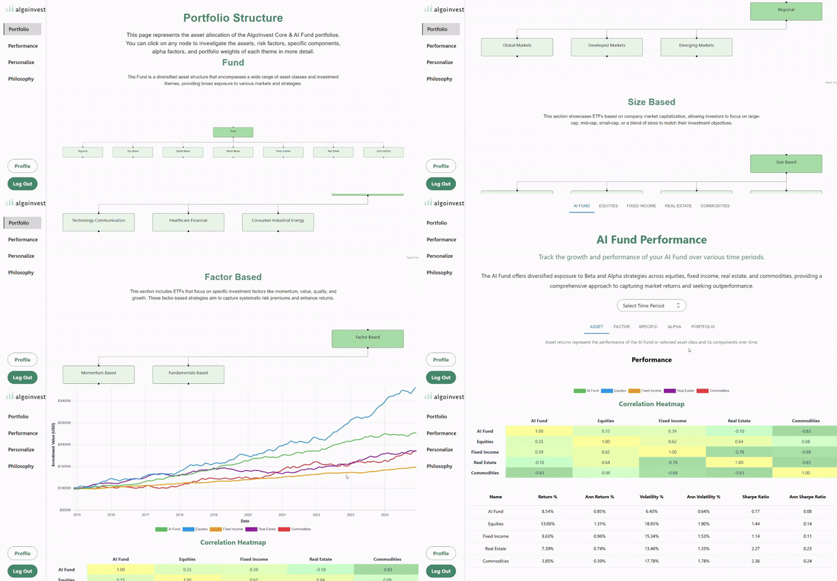
Algoinvest Portfolio Page

Algoinvest Performance Page
Insight
The initial evaluation reveals that the platform overwhelms users with too much information, hindering navigation and focus. Streamlining content and improving access to key features is essential, while a consistent branding approach is needed to enhance user trust and credibility.
Ideating Solutions
I am refining high-fidelity prototypes while showcasing the logo I designed for Algoinvest to ensure a cohesive, user-centered experience. Key contributions include:
Streamlined Navigation: An optimized page hierarchy that enhances user flows and simplifies access to platform features
Visual Design Enhancements: Polished layouts with refined typography and a cohesive color scheme to improve readability and build trust.
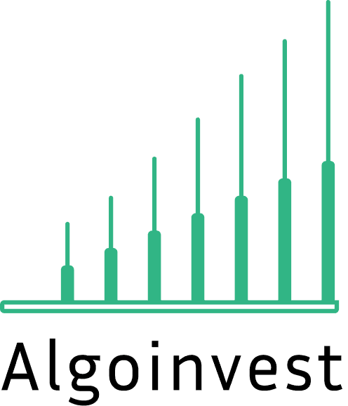
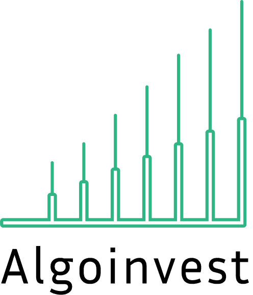
Logo - The Algowave: A design with three ascending bars symbolizing market fluctuations and growth, reflecting AlgoInvest’s mission to guide investors with clarity and data-driven insights.
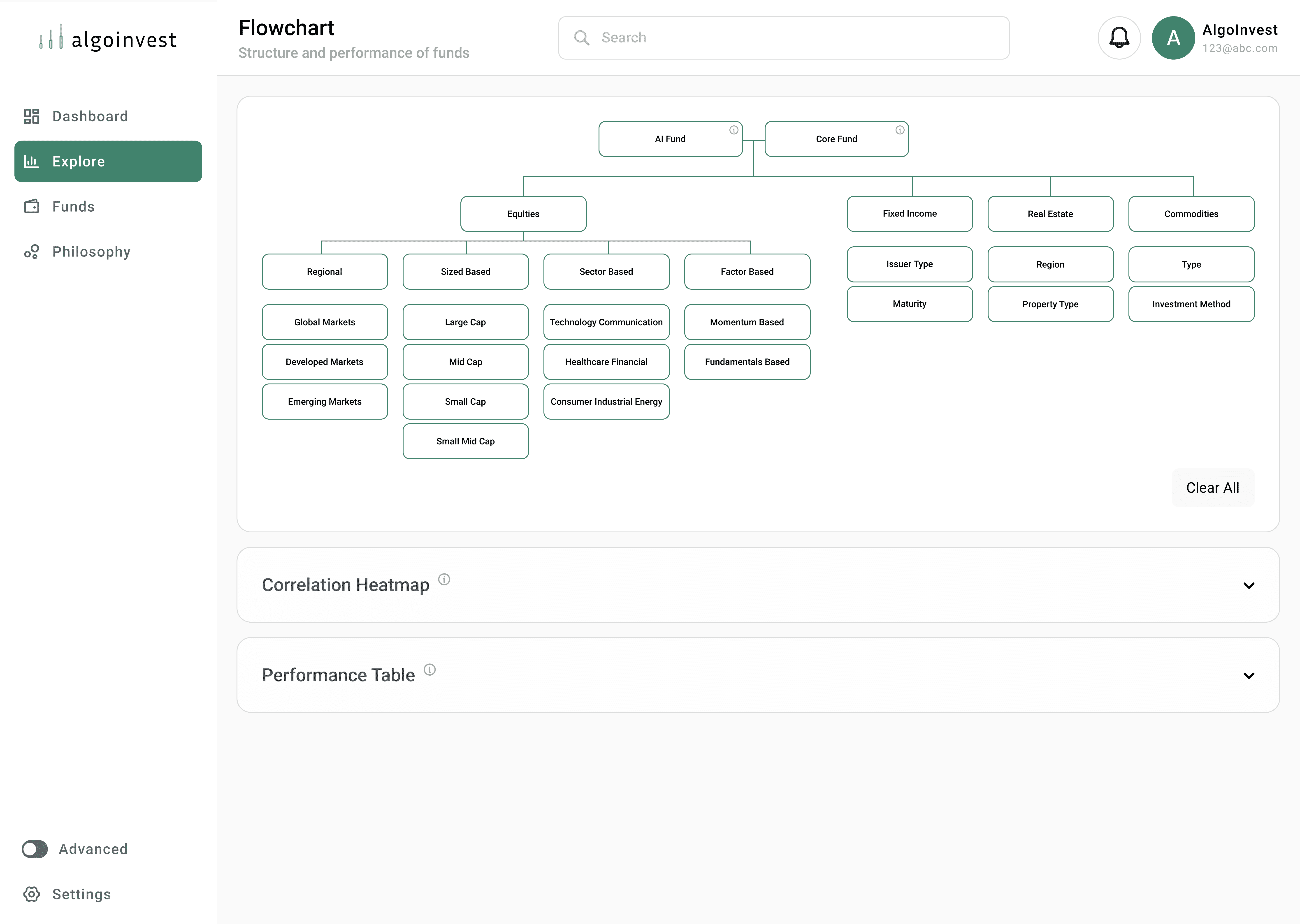
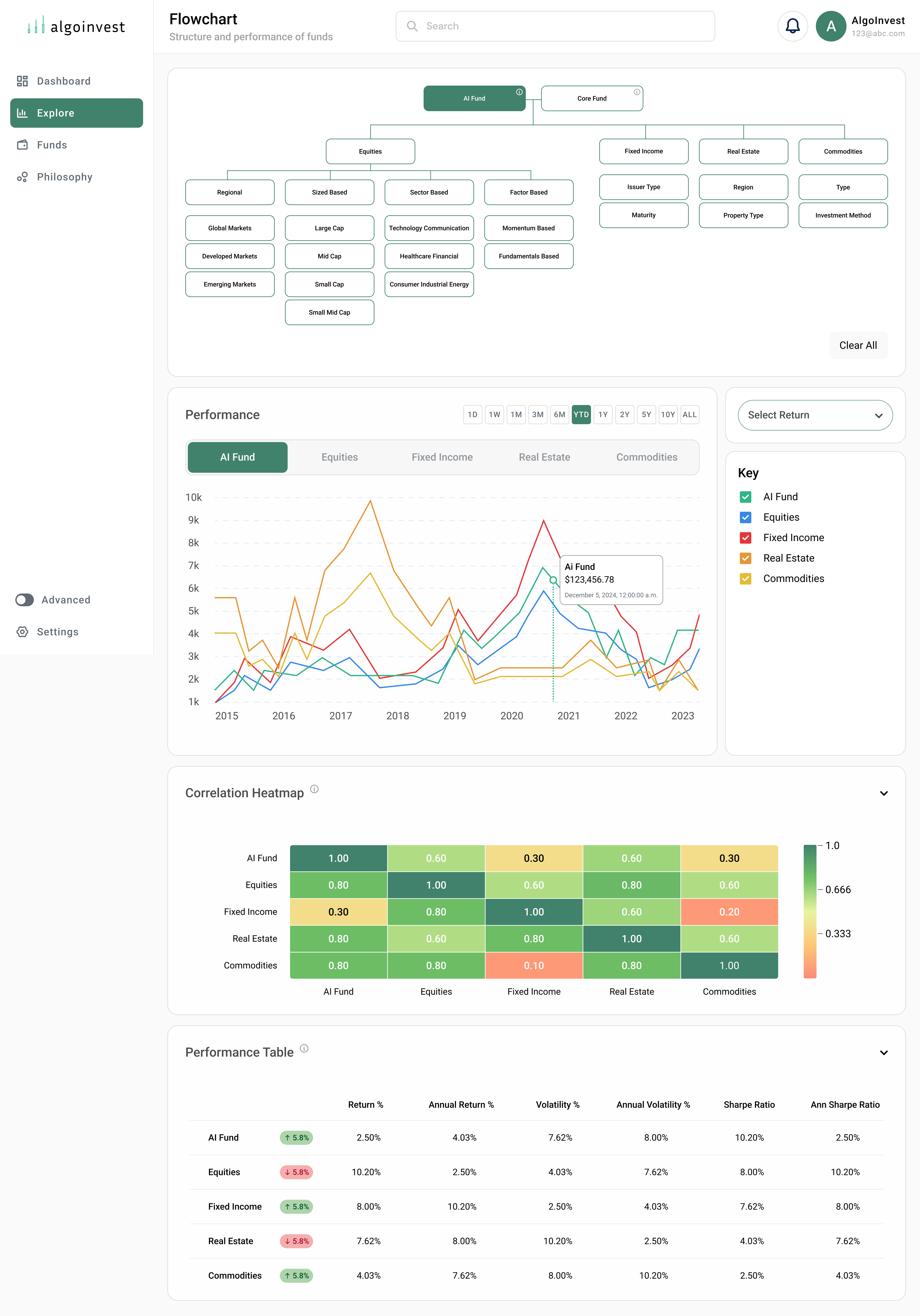
Explore Page: A streamlined flowchart that combines fund relationships and performance metrics, providing clear overviews and detailed insights.

Low-Fidelity Sketch
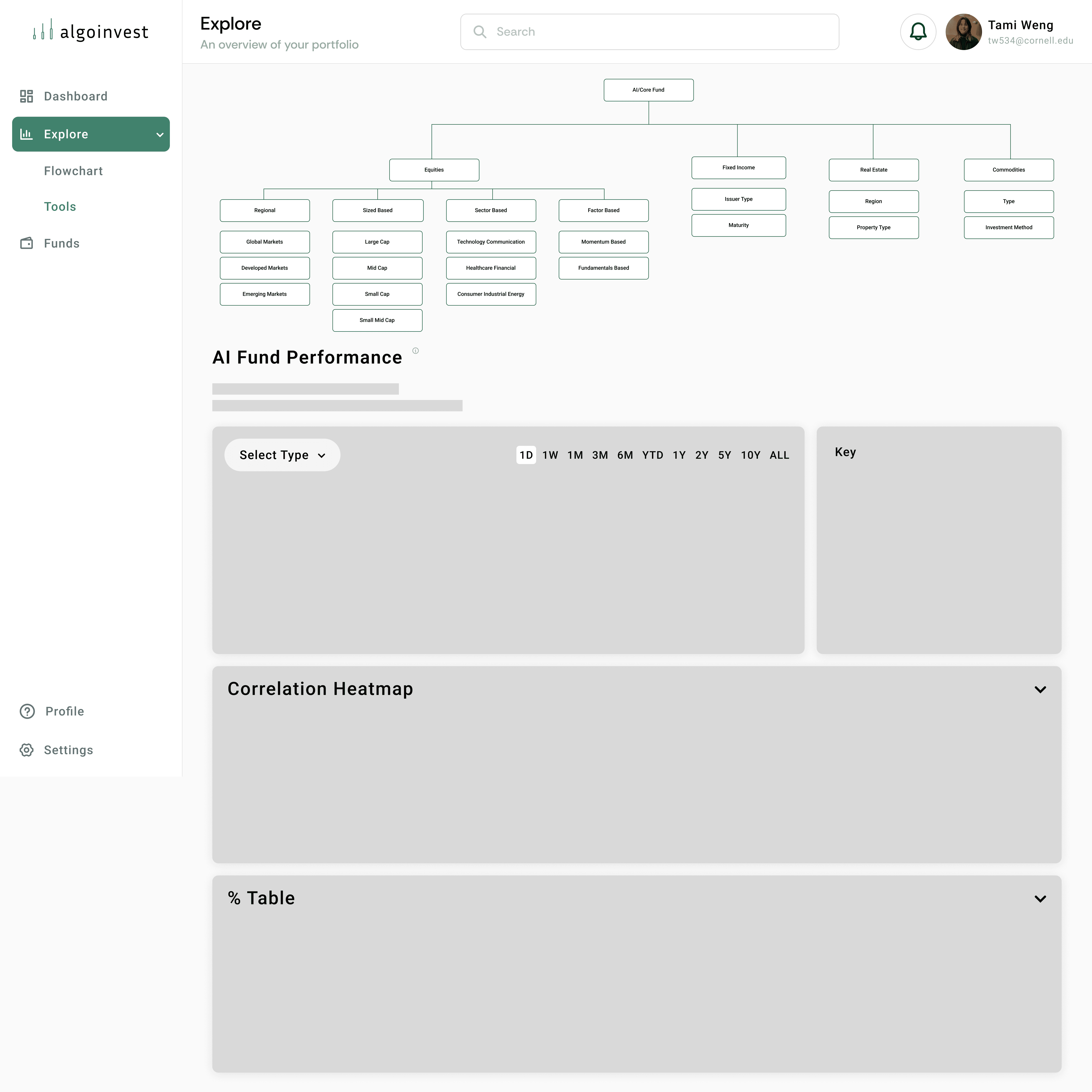
Mid-Fidelity Prototype
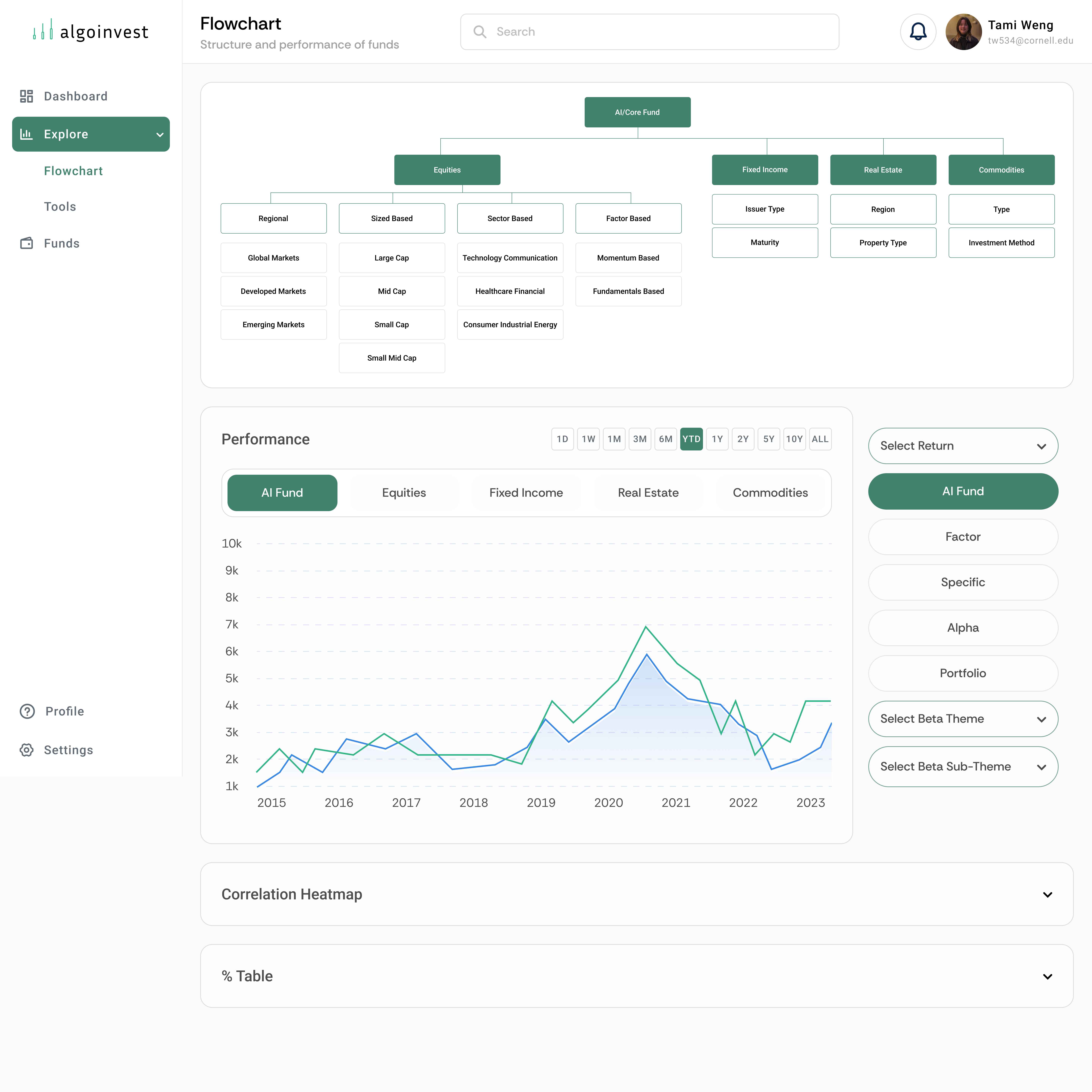
High-Fidelity Prototype
The Final Design
The final design begins with a restructured navigation system that improves user flow and accessibility across the platform. By refining the hierarchy and optimizing transitions between key sections—Dashboard, Explore, Funds, and Philosophy—I’ve ensured that users can easily navigate through the platform without friction, providing a smoother and more intuitive experience.
New Logo Design
The Algowave logo captures the essence of market fluctuations and growth through minimalistic iconography. The three ascending bars symbolize the waves of the stock market, reflecting AlgoLink’s mission to guide investors steadily toward financial success with a clear, data-driven approach.
Enhanced Explore Page
The final design unifies the Portfolio and Performance pages into a centralized Explore hub, creating a seamless experience for users. By streamlining navigation and focusing on interactive data visualizations, the redesign makes fund performance and diversification metrics more accessible.
Initial State: Default view with minimal interaction.
Expanded State: Fully selected and detailed state.
Improved Interactive Data Visualizations
Building on the previous design, significant enhancements were made to the following elements:
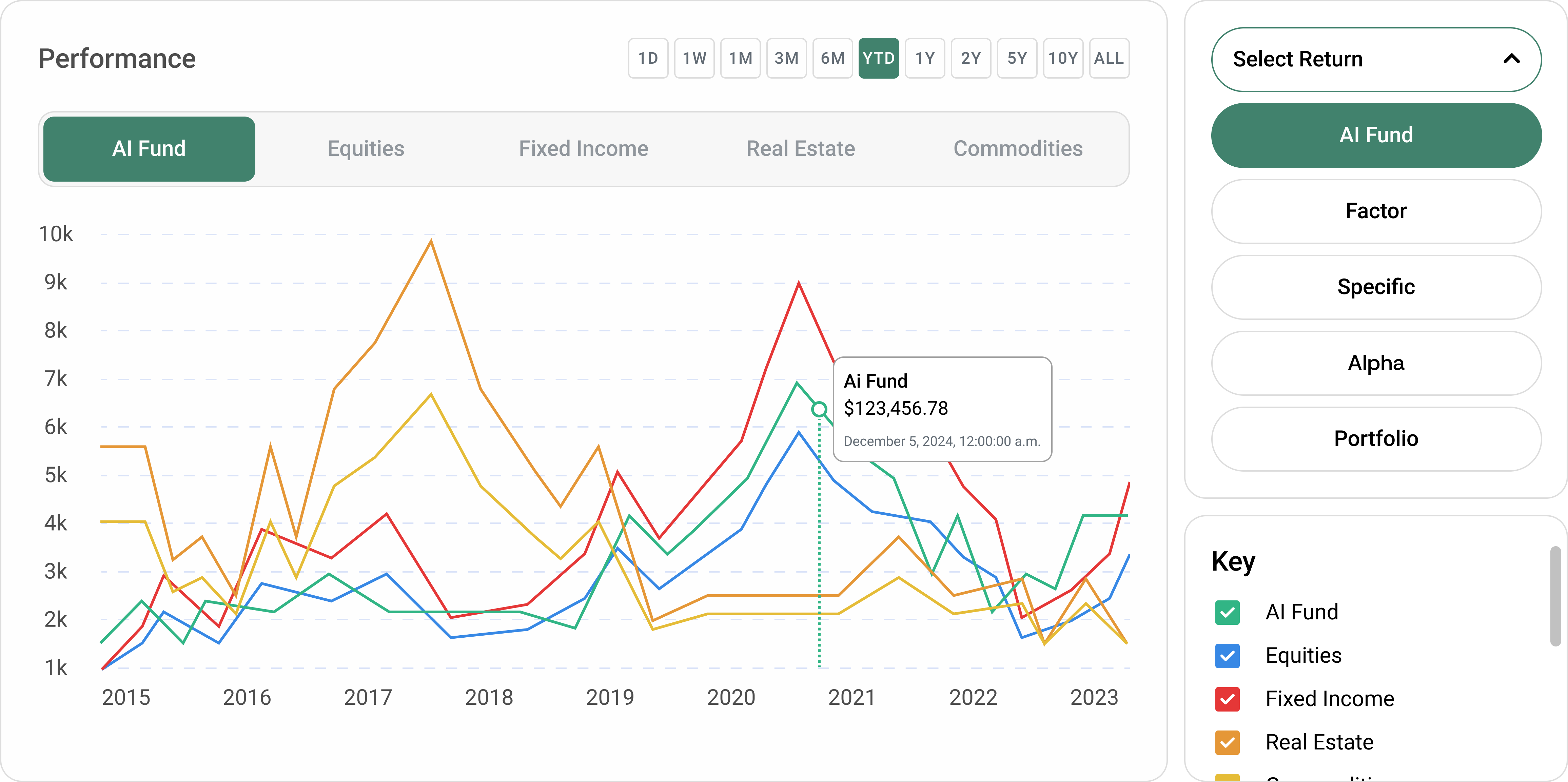
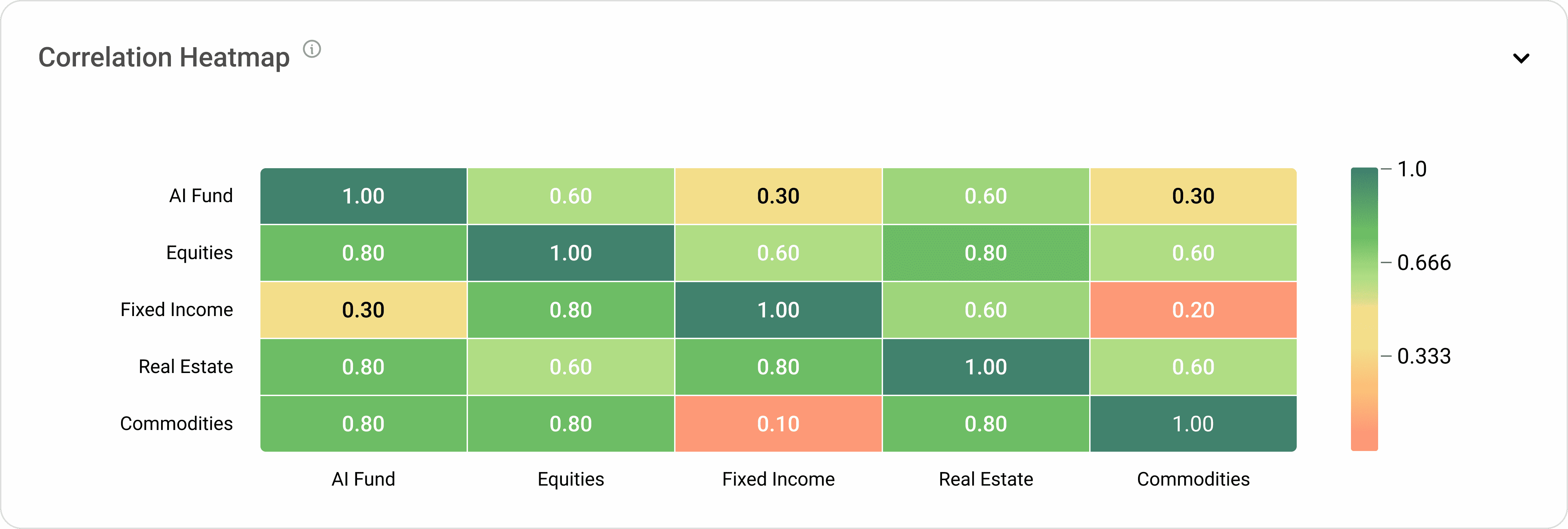

These updates maintain the functionality of the original tools while elevating the user experience with improved usability and design coherence.
Conclusion
This redesign reflects AlgoInvest’s mission to make ETF management straightforward and accessible. By combining and improving existing features, the Explore page positions AlgoInvest as a trusted tool for users seeking clarity in financial decision-making.
Reflection + Future Trajectory
This project helped me improve my skills in iterative design and balancing complexity with a clear user experience. Working with a team with limited finance knowledge challenged me to adapt and think creatively. Moving forward, I will continue iterating on the Explore page based on usability testing and focus on improving other areas of the platform to enhance the overall user experience.
